
Client | Target Corp., the official sponsor for the event
Stakeholders | The World Figure Skating Championships Local Organizing Committee, Minneapolis Visitors Association, and Target Center
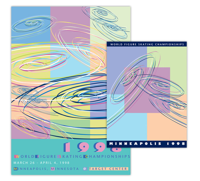
The directive from Target was to design a theme logo without using a graphic of a skate or a skater. A series of spirals were designed to represent; the etchings skaters carve into the ice during competitions; the spirals of water flowing through Minnesota’s rivers and lakes; and the numerals “98” when the spirals are rotated. The color palette was based on the icy cool pastels reflective of Minnesota winter skies.
Work encompassed
• Event branding
• Advertising
• Theme graphic
• Identity, stationery
• Posters
• Event tickets
• Event brand style guide
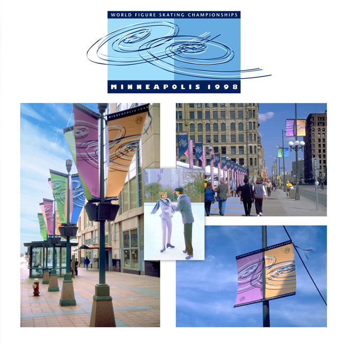
• Cityscape banners
• Branded warming tents
• Large format Target Center exterior signing
• Target Center interior banners
• Garments and merchandise design
• Branding of souvenir merchandise (baseball style caps, tee-shirts, teddy bears, cups, mugs, stickers, etc.)
The directive from Target was to design a theme logo without using a graphic of a skate or a skater. A series of spirals were designed to represent; the etchings skaters carve into the ice during competitions; the spirals of water flowing through Minnesota’s rivers and lakes; and the numerals “98” when the spirals are rotated. The color palette was based on the icy cool pastels reflective of Minnesota winter skies.
Work encompassed
• Event branding
• Advertising
• Theme graphic
• Identity, stationery
• Posters
• Event tickets
• Event brand style guide
• Cityscape banners
• Branded warming tents
• Large format Target Center exterior signing
• Target Center interior banners
• Garments and merchandise design
• Branding of souvenir merchandise (baseball style caps, tee-shirts, teddy bears, cups, mugs, stickers, etc.)
Result
The Minneapolis downtown area was colorful and kinetic during the ten day event with street scape banners, branded warming tents, billboards and window displays. Along with all the branded merchandise the event was a major success for the city of Minneapolis and Target corp.
The Minneapolis downtown area was colorful and kinetic during the ten day event with street scape banners, branded warming tents, billboards and window displays. Along with all the branded merchandise the event was a major success for the city of Minneapolis and Target corp.