AFTER - The final recommended look focused on easy-to-spot branding with large signing for the name of the café, an easier to read menu panel, a deeper chocolate colored paint for the front counter, and well-stocked grab-n-go items, beverages and merchandise.
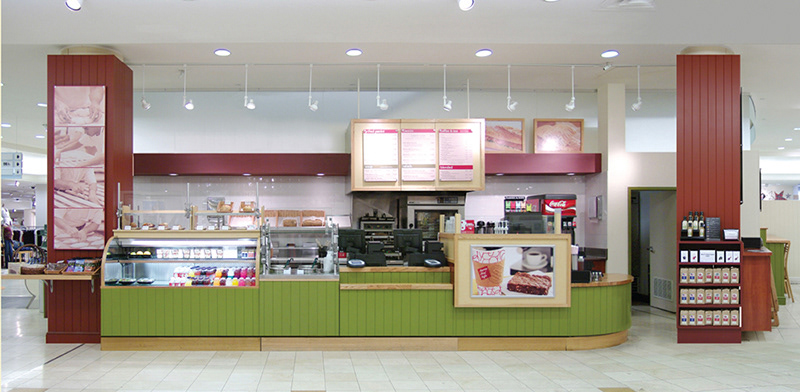
BEFORE - The Taste Bar Café lacked drama, interest and appeal. The shelves were half-empty and the large format graphics were faded.

AFTER - IttiBitz Ice Cream counter. The suggested upgrade utilized the current fixtures but turbo-charged the color palette and signing, added ice cream flavor stickers to the glass case and a step-up for little ones. Enticing and whimsical candy displays were also suggested.
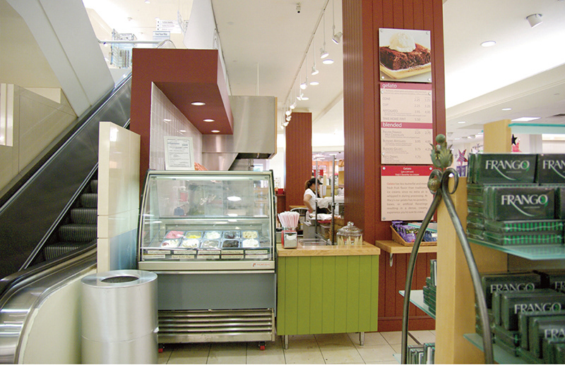
BEFORE - The Gelato counter was flat, unwelcoming and unappetizing.

AFTER - The dining area counters were enhanced with the deeper chocolate colored paint along with tiffany blue panels listing some menu items. Large scale vintage fashion photographs replaced previous photos of faded out product.

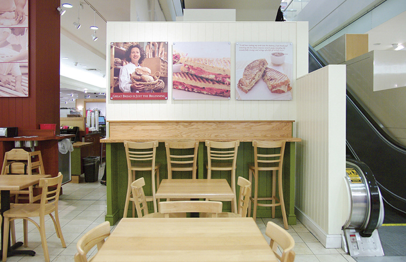
BEFORE - The olive green counters lacked drama and didn't contain the dining area well. Photos were faded and dated.

AFTER - A different view of the dining area. The furniture pops and feels snappier, as do the vertical walls with deeper vanilla tones.
BEFORE - A very unappealing dining area.